E! News
E! News delivers exclusive breaking news and in-depth celebrity coverage, red carpet livestreams, TV scoop and spoilers, lifestyle trends and tips, and what's viral now.
The project was a responsive redesign of the E! News website (Eonline.com) that gets 30M+ unique visitors per month. The site needed to work on a single codebase for faster development and rapid content delivery to save time and dollars. The site used 2 separate codebases for mobile and desktop, with an outdated CMS platform causing delays in publishing and lost opportunities to automate content.
Client
NBC Universal
Services
UI/UX Design
Industries
Entertainment
Date
March 2020
Contents
Research | Design Audit | Colors | Typography | Widgets | Navigation | Main Menu | Watch Hub | Articles | Results
Research
We started learning about competitors in the entertainment and media space. We evaluated their websites and analyzed layout and styles, patterns, and design specs on different breakpoints.
Next: UI Audit
Design Audit
We gathered and assessed all the UI components of the site with a design audit. This gave us all a better understanding of the front-end components we had to consider redesigning.
Next: Colors
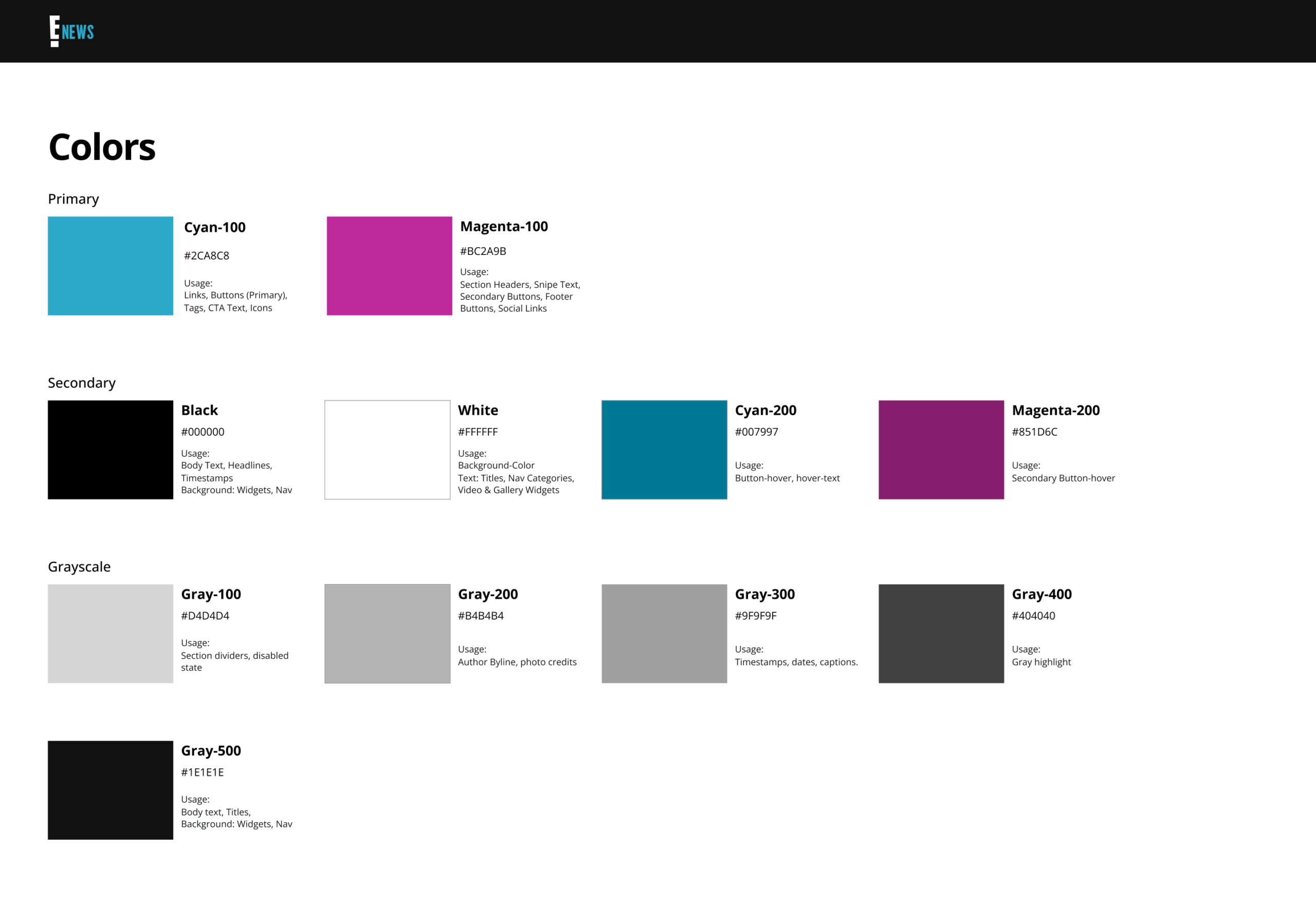
Colors
We created mood boards with assortments of fonts, colors, and visual samples that conveyed impressions of authenticity, bold & adventurous, or modern and fresh. The site needed to be an seen as trustworthy, while balancing a pop-culture look at the same time.
Next: Typography
Text Styles
For text we opted Open Sans for body and headlines because of readability, and open-source font family. It checks all the boxes in terms of conveying an authentic and trustworthy news site, and can also have Pop-insired moments of color and font weights.
Next: Widgets

Site Widgets
Widgets are the building blocks that provide structure for content presentation. We thought about each widgets presentation, content, and configurability and designed them using mobile-first approach, since traffic primarily was coming from mobile.
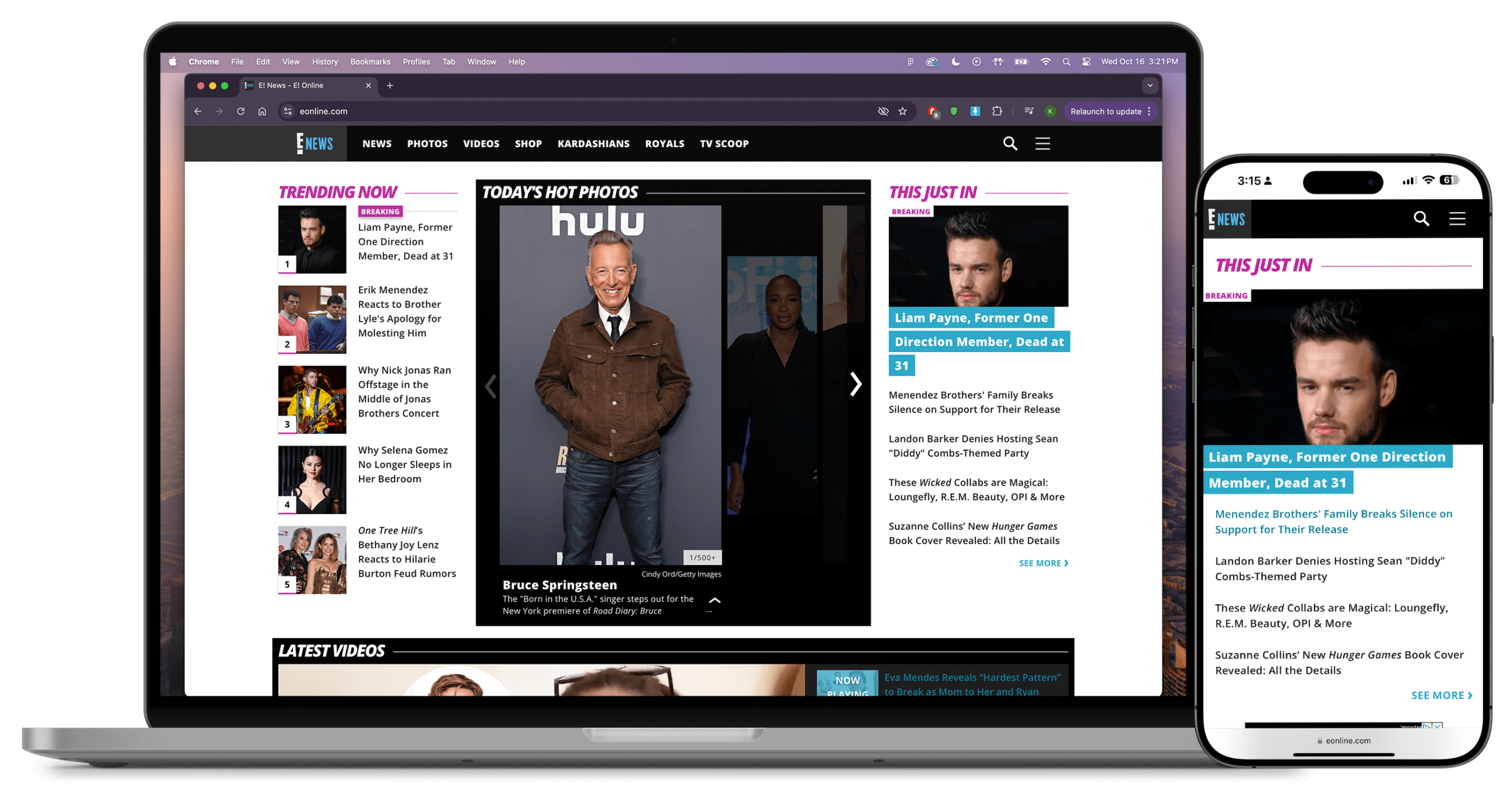
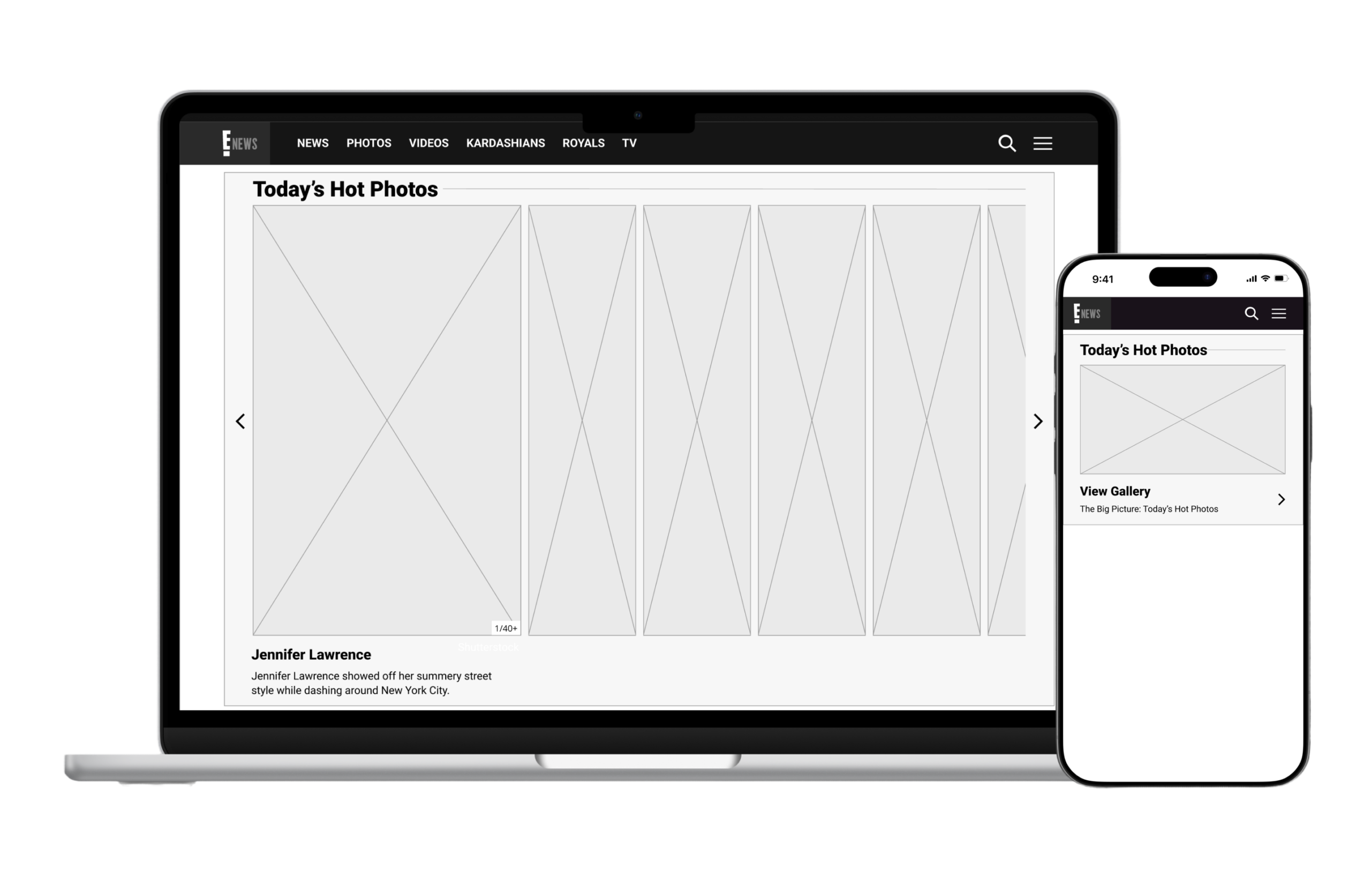
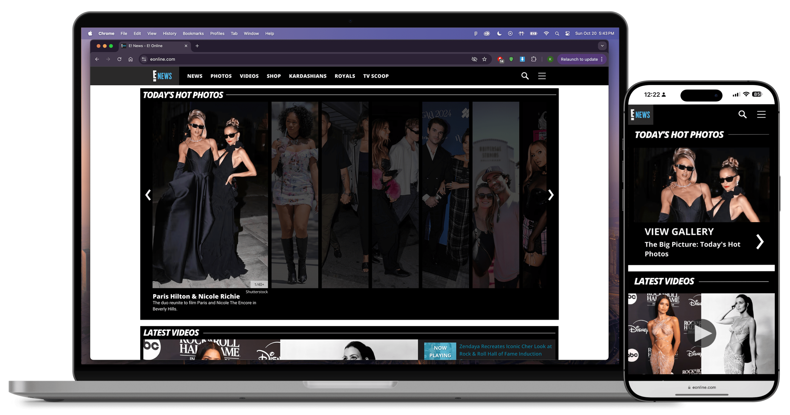
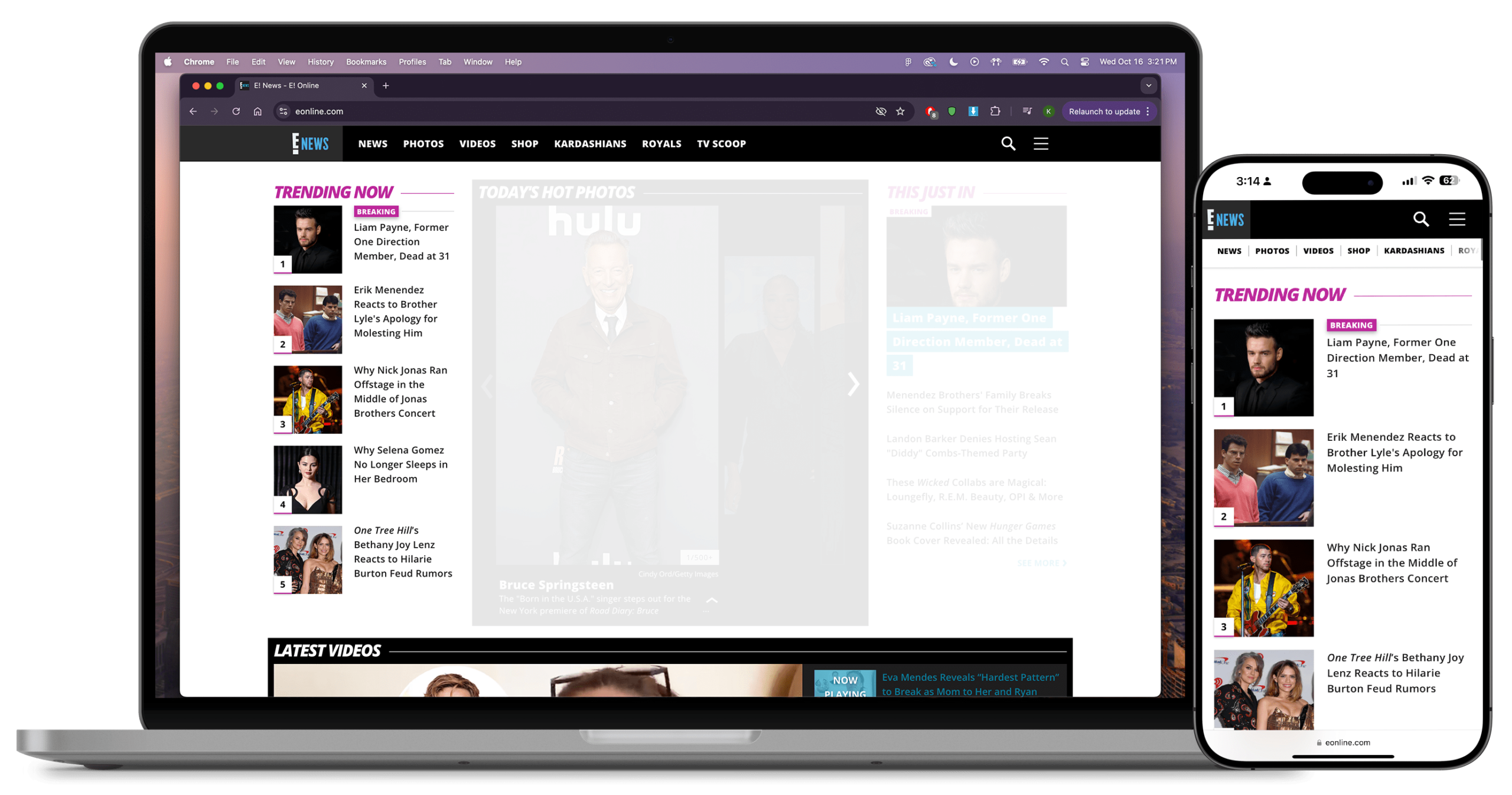
Hero widget
A hero widget is a prominent image and headline, with other additional headlines listed below. The example below is titled "This Just In".
Next: Video Widget


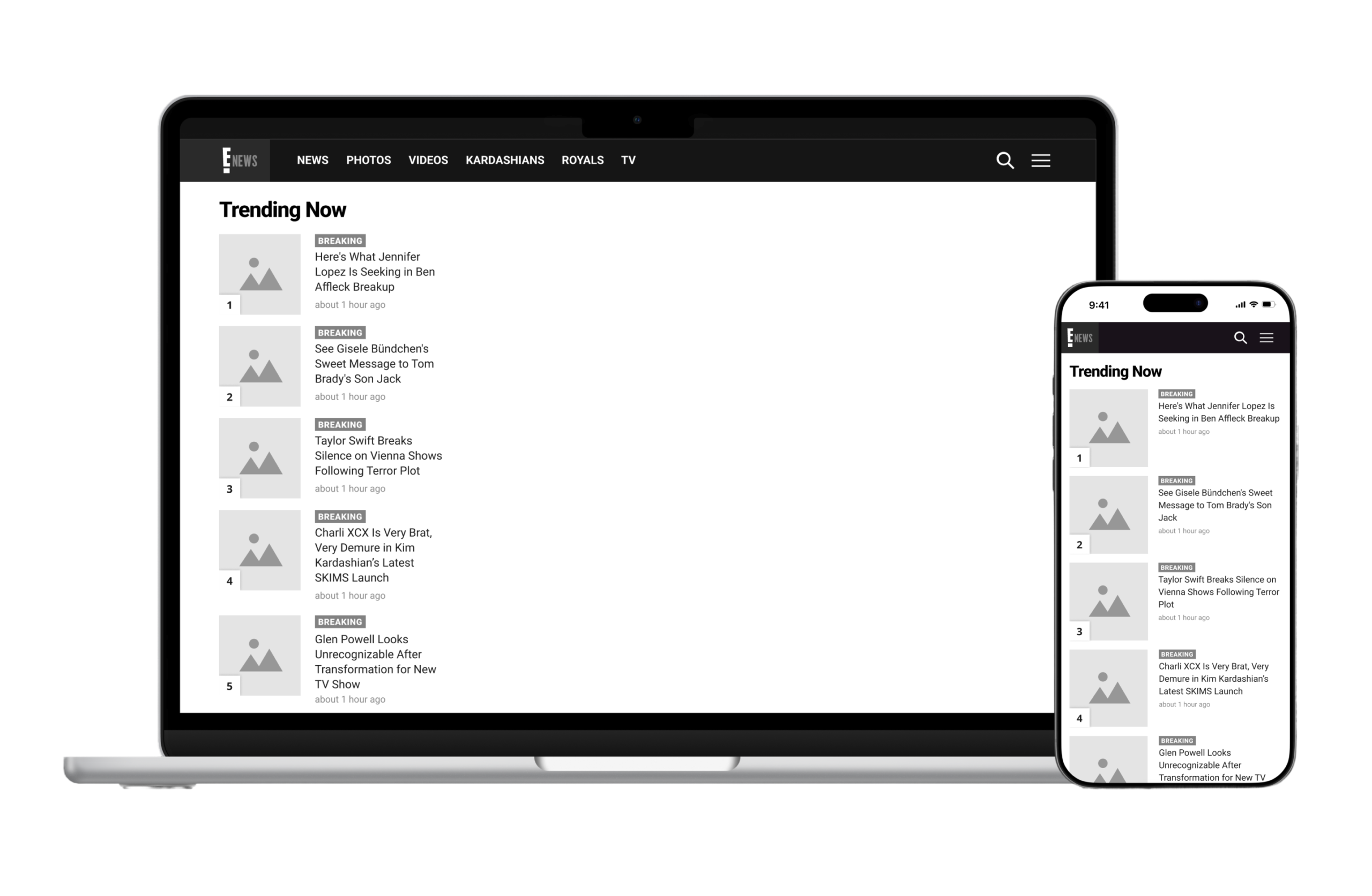
Configurable Lists
Next: Navigation
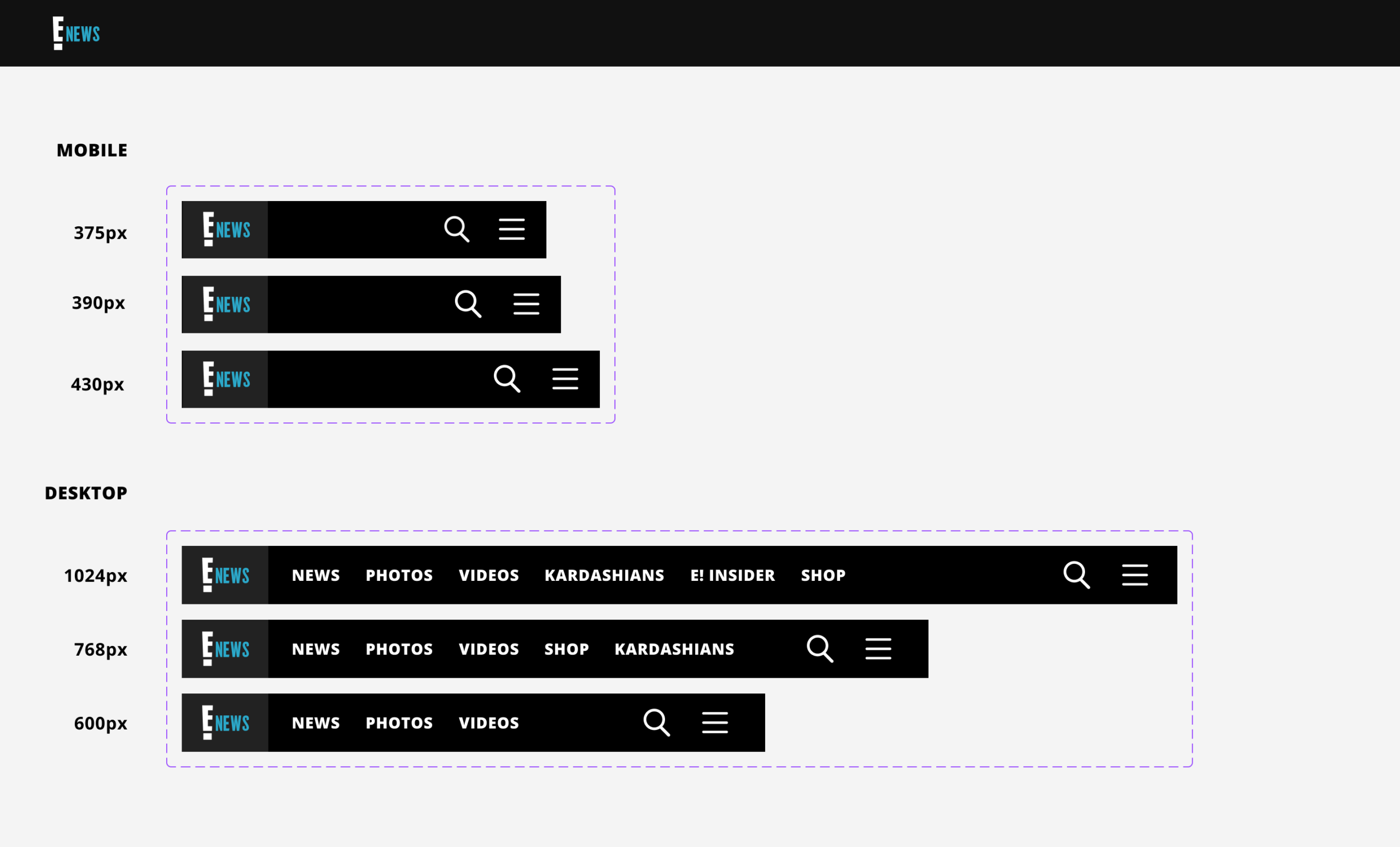
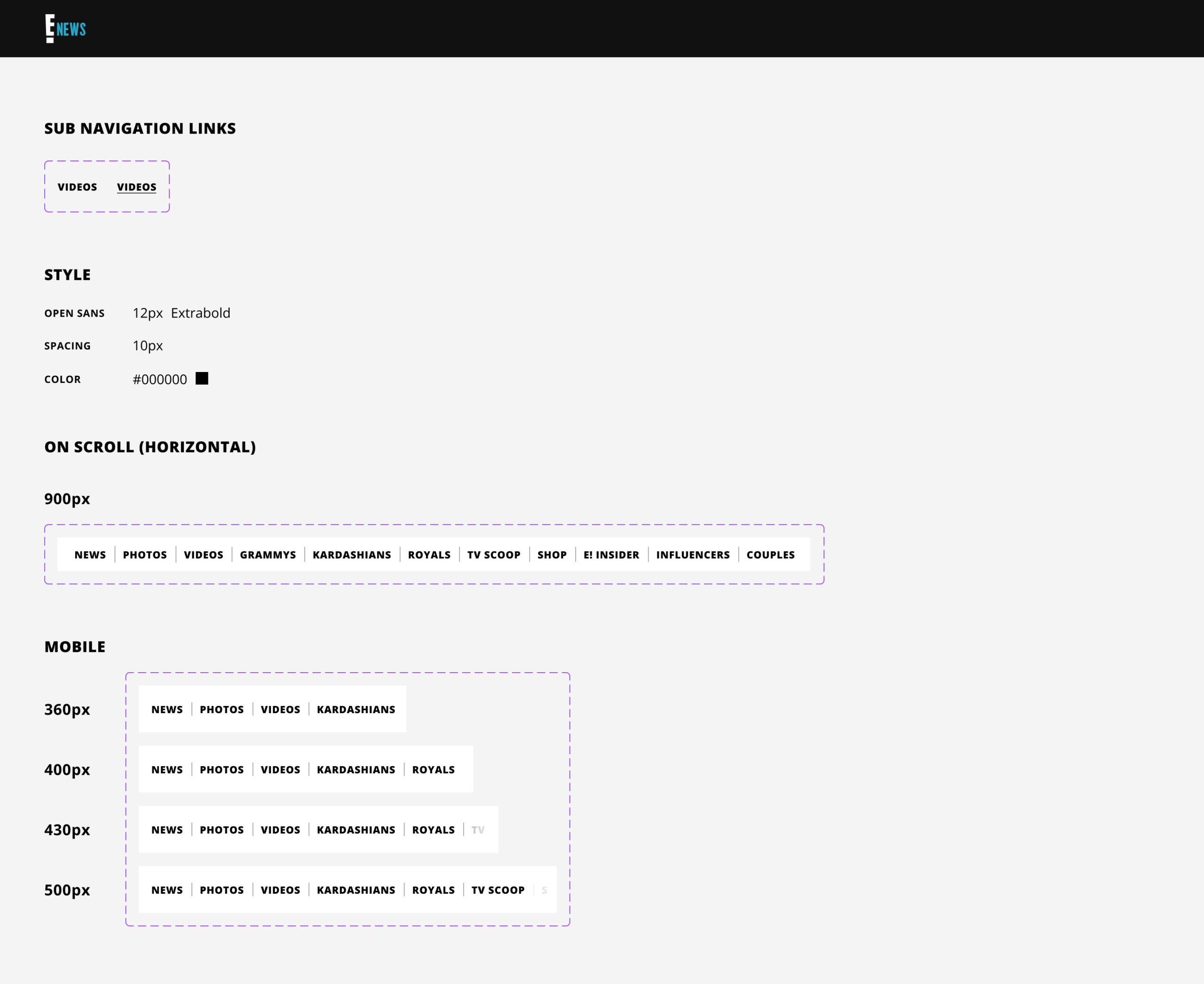
Navigation Bar
We opted for a compact design that could contain many topics and categories, to give users better accessibility to the content they care about. News, Photos and Videos would be the default sections in the navigation. Editorial can curate more popular topics, and program them into the nav from the backend CMS.
Next: Main Menu
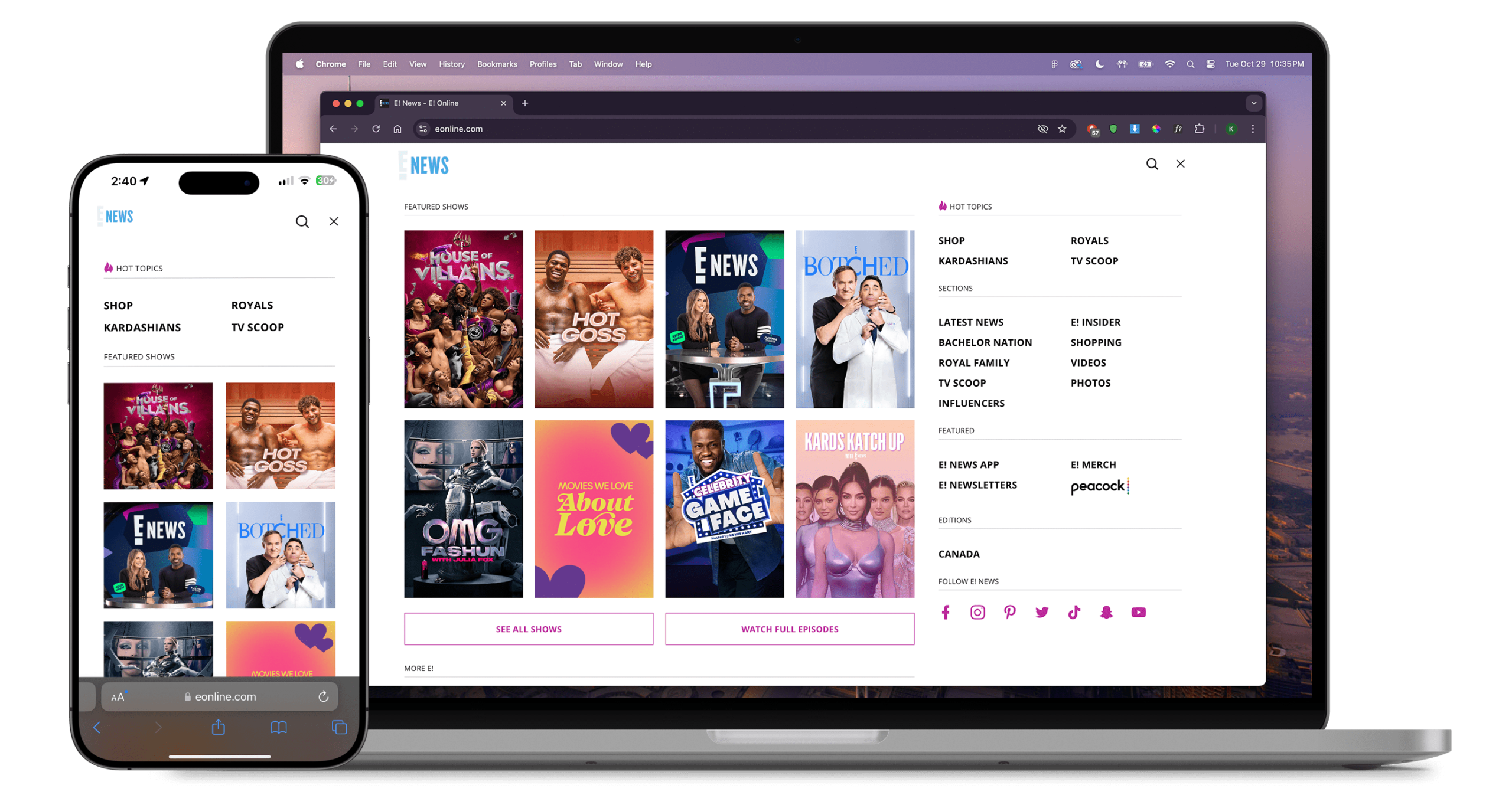
Main Menu
Shows and categories were the main priority on the menu. CTA buttons were added give users access to watch full episodes. Search, trending topics, social media channels, and footer links, were also added for quick access, and other promotional links to push subscription based content.
Next: Watch Hub
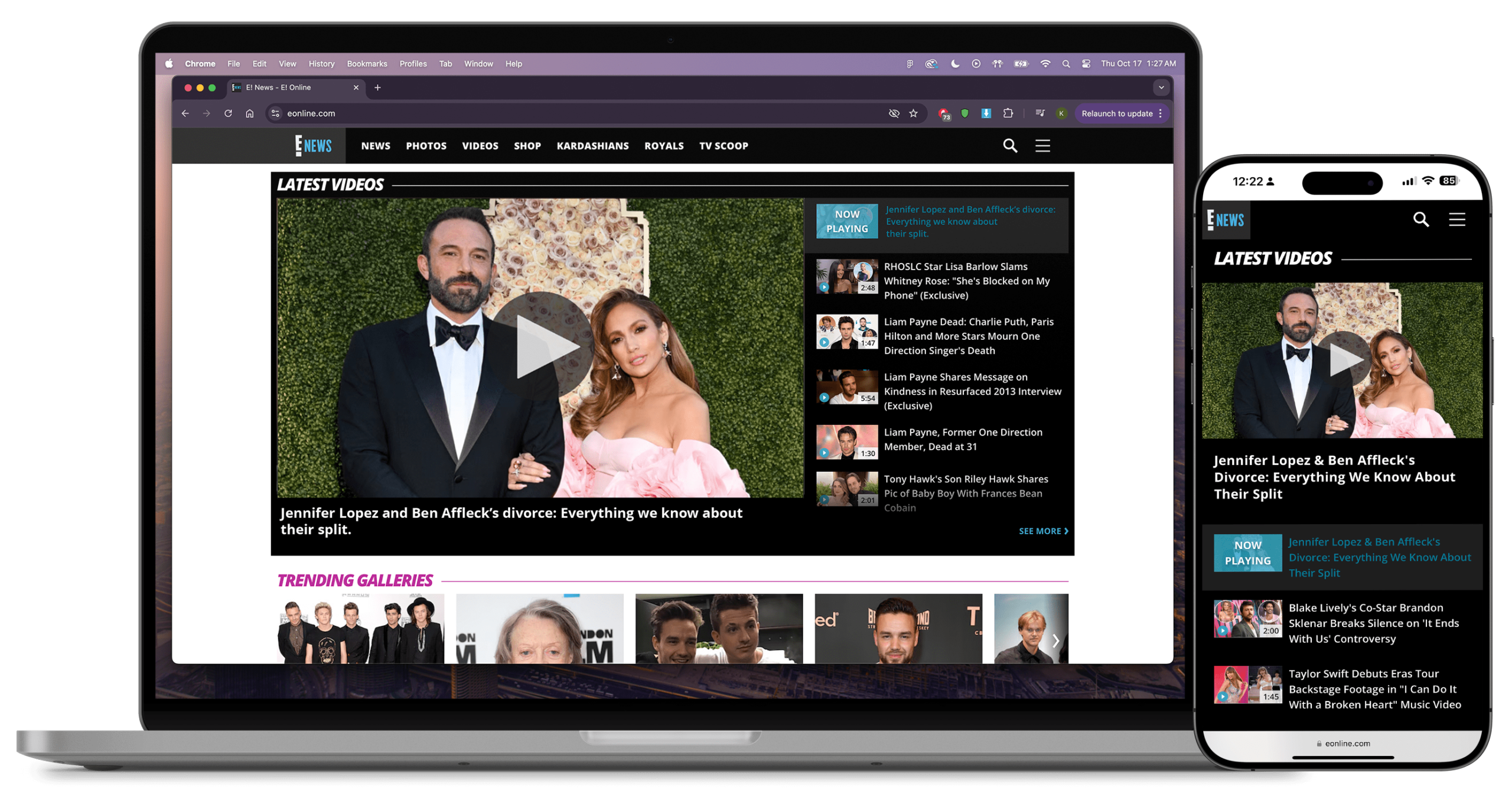
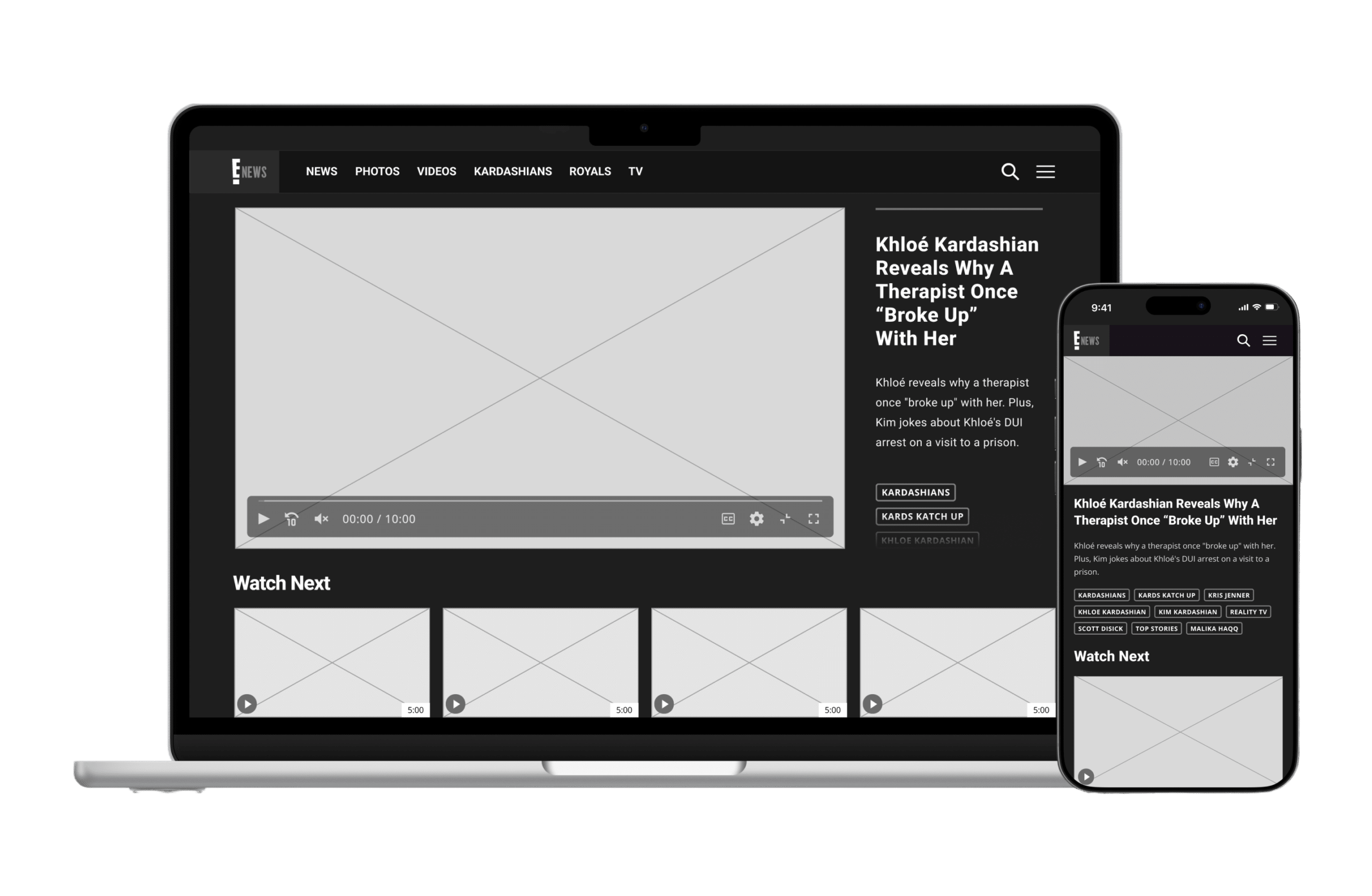
Watch Hub
The goal of the watch hub is retain users on the site, by recycling content to keep them watching. We enabled autoplay next video as a way to loop continuous videos from a playlist or related videos after the initial video ends.
Next: Article Page
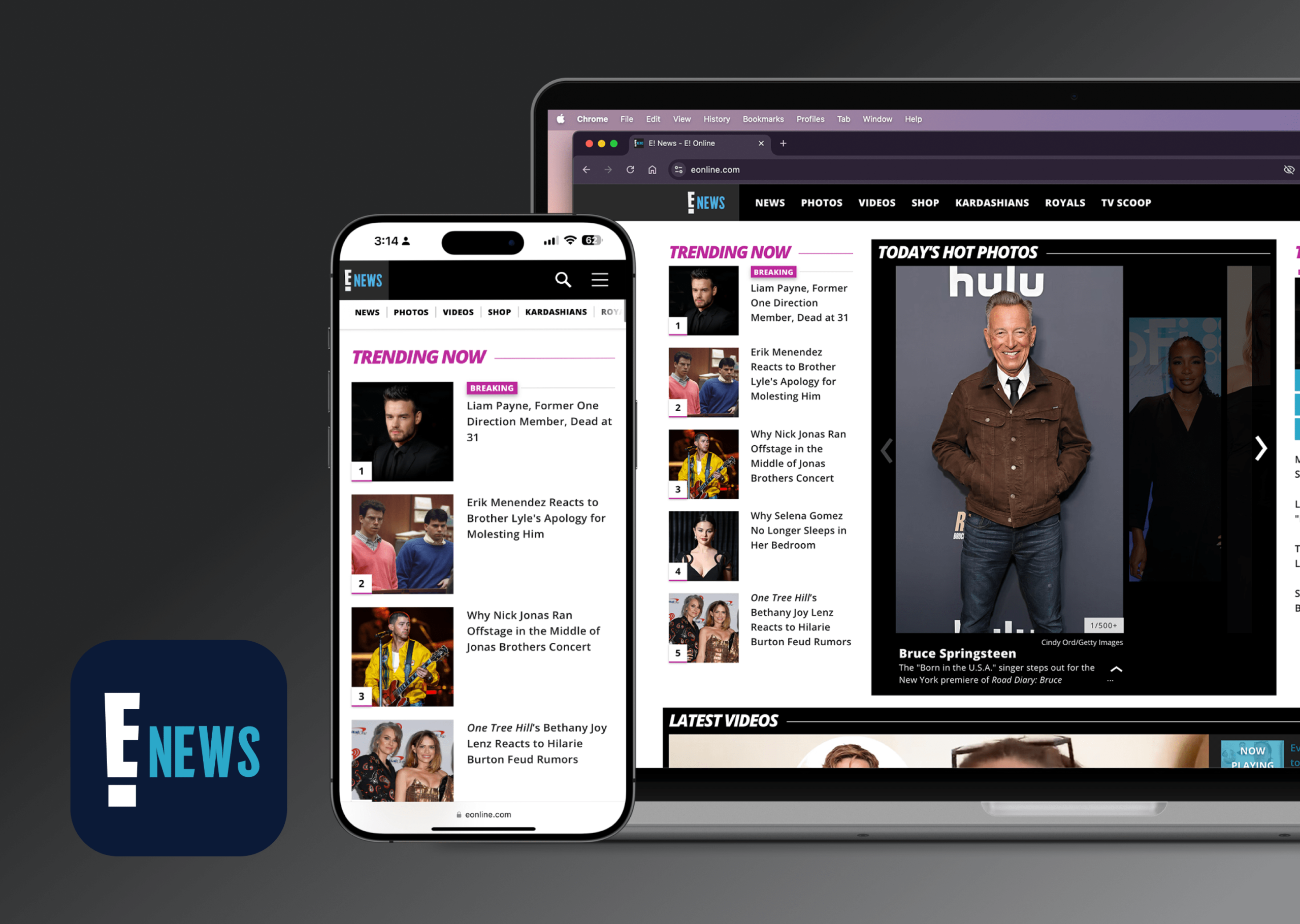
Article Pages
Data from our analytics team suggested users were landing on articles from Google search, searching for celebrities and recent news. We aimed to retain users by serving related articles, photos and videos. Editors would tag articles, photos and other media, through our CMS, which would programatically be served upon viewing related stories or media.
Next — Results
Results
Best Entertainment Site Nominee
Webby Design Awards, 2021
Faster Publishing & Content Automation
A new CMS combined with customizable widgets on the responsive grid enables rapid and streamlined publishing and automated content.
150k+ Subscriptions
To E! News exclusive content and streaming.
Improved Monetization
Unlocked additional areas for monetization, bringing in additional revenue streams from advertisers & sponsored content.
Kyle Justice
PRODUCT DESIGNER
© 2025, Kyle Justice.
Get in touch 💬
Services 🛠️
Product Design
Graphic Design
Branding
Illustration